A new direction for a teacher wellbeing startup
Project overview
Welbee were planning to expand into new markets and verticals (public and private sector companies). They felt it was time to refresh their sales website strategy and worked with me to prototype options for a way forward.
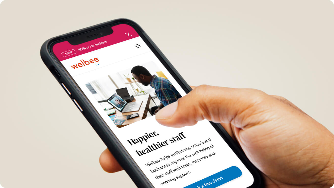
Welbee helps schools to systemise their staff wellbeing through digital products including tailored surveys, direct anonymous feedback tools and monitoring dashboards, so that senior school leaders can check in regularly on staff happiness and make improvements; fast. Their products are currently used by 200+ schools in the UK. Welbee’s primary target audience were senior school leaders and headteachers, but they now needed to appeal to business leaders and international schools too.
Research phase
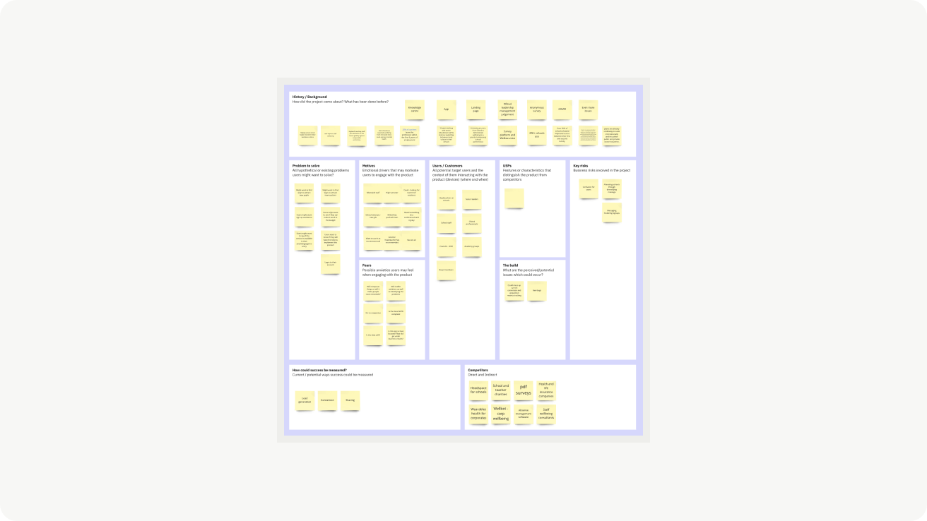
I held a workshop with the Welbee team and filled in a project kick off canvas. This helped to quickly collect all assumptions, identify knowledge gaps, and plan and structure the research approach and ensure expectations were aligned.
I interviewed local and international headteachers and business leaders to understand their staff wellbeing needs and track down new opportunities and inspiration.
I also conducted a UX audit and ran some user testing sessions to monitor the performance of the current site’s usability and content and help to prioritise the focus of the strategy prototype.
The main issues identified were:
-> The pricing structure was confusing for testers
-> None of the testers understood Welbee’s new Voice product
-> Testers felt there was too much information on the homepage
-> Information was not displayed on the pages they expected
-> Terminology was better-suited to school employees than business people
-> Visually the site wasn’t always consistent

"We regularly run surveys through our MIS (School Management Information System) and we have won Staff Wellness awards. Staff wellness is so important to us"
Headteacher
Secondary School
Accessibility improvements
I ran some tests on the accessibility of the site and created a more accessible colour palette and typography system which then passed WCAG AA standards.
.png)
Navigation and pricing page improvements
Navigation
I used clear terms like ‘Products’ and ‘Resources’ to cater to a broader audience, plus separated out ‘industries’ so future unique selling points could be pitched to their appropriate audiences.
Each product had its own dedicated page and I added a notification bar at the top of the page, above the navigation menu to highlight new products and updates.
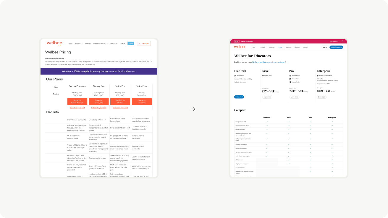
Pricing
I suggested a pricing package model with clear visual differentiation on additional benefits available as price increased. This would be more scalable as the business expanded into other industries.
.png)
The result
I streamlined the site’s content, focused strongly on the products and their unique selling points; key client logos and testimonial quotes that testers responded well to. I delivered a prototype to present to the board and to use in investment pitches.


How can I help you explore new business directions?
A prototype can speak 1000 words. Help explain your vision to your executive team. Let's discuss how to bring your strategy to life.
More projects
Here are some similar projects to explore.
.png)