What are focus states and why do they matter?

What are focus states?
Focus states are visual signs that an element in an interface is currently selected or active. They are typically triggered by keyboard navigation or other assistive technologies.
They are really important because they help people, especially those using keyboard navigation (people who cannot rely on a mouse or touchpad) or assistive technologies (screen readers, for example, often use keyboard commands), to understand where they are in an interface and interact effectively with it.
Focus states help all interface users to navigate content and not get lost. Consistency across each element helps aid a seamless experience.
For compliance, focus states are also important. It can be a legal requirement that your interface is accessible to everyone.
Browsers have built-in focus states but developers often disable them by mistake. You should either have these enabled or you should trigger your custom brand focus states.
.png)
What elements have a focus state?
Elements that navigate or interact with an interface.
- Links
- Form elements - input fields; textareas; dropdowns and selects; submit buttons; form labels
- Interactive elements - standard buttons; input type buttons; checkboxes; file upload controls; sliders; colour pickers
- ARIA role elements - items that function like all the elements above because they have special ARIA labels in the code
- Anything custom with interactive behavior - divs and spans that are interactive (e.g. a button created in JavaScript)
- Navigation menus - those that are clickable, or expand and contract
- Audio or video controls
.png)
How to design focus states
Effective focus states require a team effort. UX and UI design, content and development have an effect on how focus states are experienced.
Built-in focus states often do not match your brand’s design and can only be triggered if your code is correct.
When you create a design system or brand, you want to ensure you have planned for different focus scenarios from a content, design and development perspective.
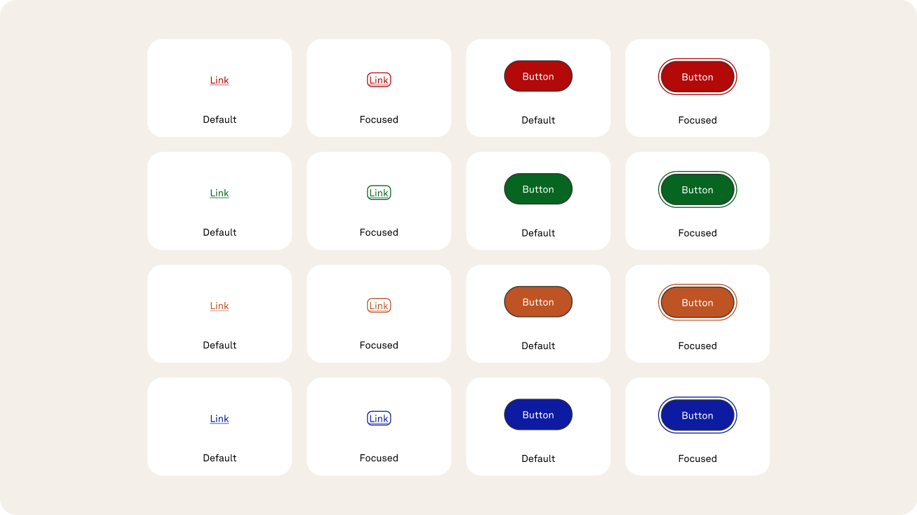
What do focus states typically have?
- An outline. Focus states have a high contrast border around the focused element, this needs to be 2px or more for maximum compliance
- The element may also change background colour on focus, but this is less common
- The outline needs to work on different background colours, with accessible contrast levels
- In products your focus states will usually need to work with success, error, warning and information elements, which typically have a different selection of colours to your main brand elements
- You can use design plugins like Contrast for Figma and Stark for Sketch, Figma and Github to make sure your focus borders have a high contrast
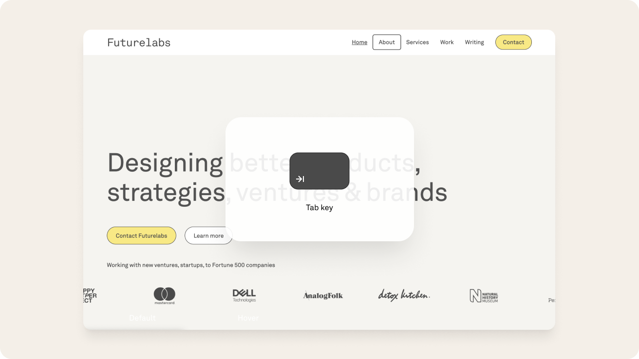
How to test your focus states
Testing focus states is fairly easy.
- Use the tab key on your keyboard - on keyboard navigable interfaces you can use your tab key to activate the focus states on your interface and run through each focused element. You can check everything works in the correct order and that your focus states are clear and uniform.
- Use accessibility tools - you can use tools like Lighthouse, Axe, or Wave.
- Get real-world feedback - test your products with users with a variety of accessibility requirements.
Resources
- WGAG guidelines on focus states: https://www.w3.org/TR/UNDERSTANDING-WCAG20/navigation-mechanisms-focus-visible.html
- I love the focus states documentation in the Wise design guidelines: https://wise.design/foundations/focus-states
- The UK government design system (GDS) has fantastic and thorough information about focus states: https://design-system.service.gov.uk/get-started/focus-states
Related posts
Here’s some articles you might like too.
.png)
.png)
.png)
Focus on accessible products
Are you looking to create an accessible Design System for your product or website? Let's work together to make it happen.